Color Theory and Ratios Calculation in Interior Design
Color Theory and Ratios Calculation for Interior Design: Discover how to create harmonious and balanced color schemes using proven principles like the 60-30-10 rule, complementary and analogous color harmonies. Our interactive calculator helps you visualize dominant, secondary, and accent colors with precise HEX codes, making it easy to plan stunning interiors that evoke the right mood and style. Perfect for designers and DIY enthusiasts seeking expert color balance and aesthetic appeal.
Color Theory and Ratios Calculation
Color Theory and Contrast Ratios
Color contrast ratio is a key concept in color theory, especially important for accessibility and design. It measures the difference in luminance between two colors, which affects readability and visual comfort.
-
Relative luminance is calculated for a color in the sRGB color space using the formula:
Here,
R,G, andBare linearized values derived from the sRGB components normalized between 0 and 1. The linearization uses:If
CsRGB ≤ 0.03928, then
else
whereCsRGB = C8bit / 255for each channelR, G, Brespectively. -
Contrast ratio between two colors is then:
where
L1is the luminance of the lighter color andL2is the luminance of the darker color. This ratio helps define standards for good contrast in text and graphics, crucial for accessibility.
Ratios in Color Mixing
When physically mixing colors (like paints or inks), ratios determine the resulting color. The process is more complex than simple addition because of how pigments interact, but mathematically it can be approximated by weighted sums of RGB values:
-
Suppose you want to mix
ncolors(ri, gi, bi)in proportionspito achieve a target color(R, G, B). The problem can be formulated as:
with constraints
pi ≥ 0and∑ pi = 1(if normalized). Solving these equations (often via least squares or optimization) yields the mixing ratios to approximate the target color. - This approach can be refined by rescaling equations or adding constraints to ensure realistic pigment proportions. The solution depends on the number of colors and the feasibility of matching the target exactly.
Practical Use of Ratios in Color Theory
- In design and art, color proportions often follow rules such as using primary, secondary, and tertiary colors in ratios like 60%, 30%, and 10%, respectively, to create harmonious combinations.
- When mixing inks (cyan, magenta, yellow), the perceived color changes non-linearly with ratios. Incremental additions of one color produce diminishing changes in the mix, illustrating the importance of considering part-to-whole relationships rather than just linear ratios.
- Color wheels and harmony calculations use mathematical divisions (e.g., dividing 360° by 12 to get 30° hue intervals) to structure color relationships systematically.
Interior Design Color Ratio Calculator
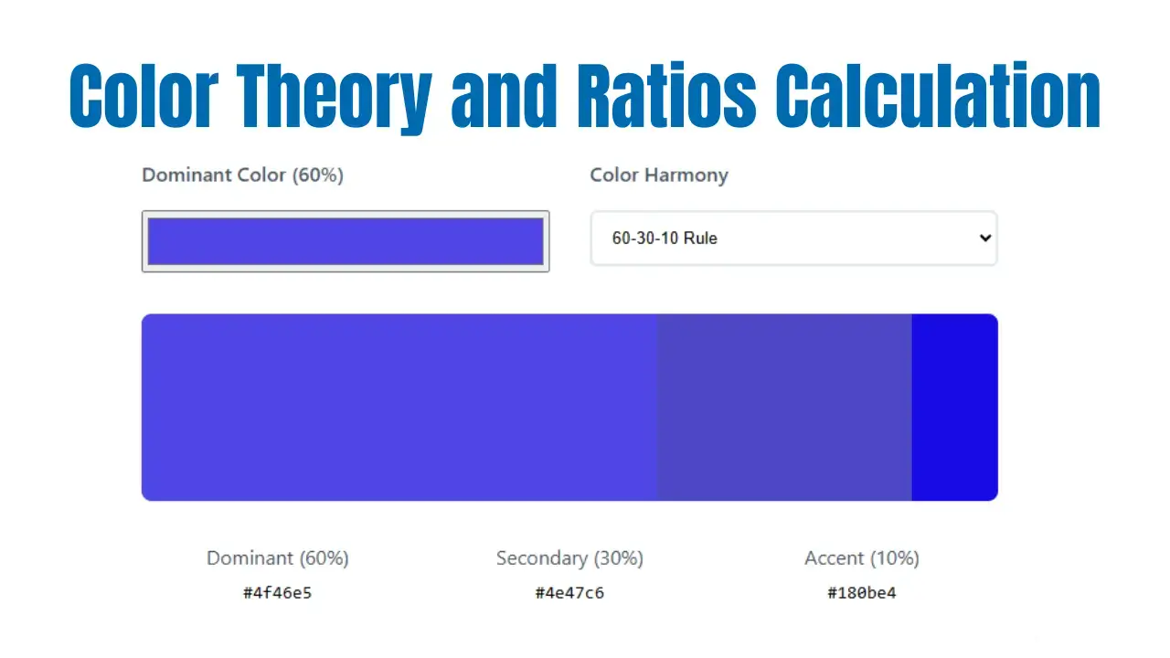
Dominant (60%)
Secondary (30%)
Accent (10%)
What Is Color Theory in Interior Design?
Color theory in interior design is both a science and an art that explores how colors interact, influence perception, and evoke emotions to create balanced, harmonious, and visually appealing spaces. At its core, color theory helps designers and homeowners select color palettes that not only enhance the aesthetic appeal of a room but also affect mood, spatial perception, and the overall atmosphere. By understanding fundamental concepts such as the color wheel, color harmony, and the psychological effects of colors, you can make informed decisions that elevate the look and feel of any interior.
The color wheel, originally developed by Sir Isaac Newton, is a foundational tool in color theory. It organizes colors into primary (red, blue, yellow), secondary (green, orange, purple), and tertiary hues, illustrating their relationships and guiding effective combinations. For example, complementary colors-those opposite each other on the wheel like red and green-create vibrant contrasts that energize a space, while analogous colors-adjacent hues like blue, blue-green, and green-offer soothing, harmonious blends that foster calm and cohesion.
Applying color theory in interior design involves more than just picking pretty colors. It requires balancing proportions through guidelines like the widely used 60-30-10 rule, where 60% of a room is dominated by a primary color, 30% by a secondary color, and 10% by an accent color. This ratio ensures visual balance and prevents any single color from overwhelming the space. Additionally, understanding warm colors (reds, oranges, yellows) and cool colors (blues, greens, purples) allows designers to tailor the mood-warm tones energize and invite social interaction, while cool tones soothe and promote relaxation.
Beyond aesthetics, color theory also considers the psychological impact of colors. For instance, blues and greens are known to reduce stress and enhance tranquility, making them ideal for bedrooms or meditation spaces. In contrast, yellows and reds can stimulate creativity and conversation, perfect for kitchens or living rooms. Neutrals like whites, grays, and beiges serve as grounding backdrops that balance bolder hues and add sophistication.
In practice, designers use color theory to craft palettes that reflect the function and personality of a space. They carefully test colors under different lighting conditions and combine textures and patterns to add depth and interest. Whether creating a cozy living room with warm analogous colors or a dynamic office with complementary contrasts, color theory provides the framework to achieve intentional, beautiful interiors.
Why Are Color Ratios Important?
Color ratios are essential in interior design because they help create a harmonious and visually balanced environment. Without proper color proportions, a room can easily become overwhelming, chaotic, or monotonous. By thoughtfully applying color ratios, designers ensure that no single color dominates the space, allowing all elements to work together for a cohesive look.
One of the most effective and widely used guidelines is the 60-30-10 rule:
- 60% Dominant Color: This is typically the main color in the room, often seen on walls, large furniture pieces, or flooring. The dominant color sets the overall mood and serves as the backdrop for the entire space.
- 30% Secondary Color: The secondary color supports the dominant hue and is usually present in items like sofas, area rugs, curtains, or feature walls. This color adds contrast, depth, and visual interest without overpowering the main color.
- 10% Accent Color: The accent color is used sparingly in accessories, artwork, cushions, or decorative pieces. It injects personality, vibrancy, and focal points into the design, drawing the eye to key features.
Applying the 60-30-10 color ratio helps achieve visual balance, ensuring the space feels intentional and well-designed. This technique prevents color overload and creates a sense of order, making the room both inviting and aesthetically pleasing. It also guides the viewer’s eye naturally around the space, highlighting important design elements and creating a unified look.
By using color ratios, interior designers can confidently combine bold accent colors with neutral tones, experiment with complementary or analogous color schemes, and maintain a sense of proportion and flow throughout the room. Whether you’re decorating a living room, bedroom, or office, following these color balance principles will help you achieve a polished, professional result.
How to Use the Color Theory and Ratios Calculator
To use the Color Theory and Ratios Calculator effectively for your interior design project, follow these simple steps:
- Pick Your Dominant Color:
Begin by selecting the main color that will set the tone for your space. This dominant color typically covers about 60% of the room, such as walls, large furniture, or flooring. You can choose this color using a color picker or by entering a HEX code, ensuring it aligns with your design vision and mood goals. - Choose a Harmony Type:
Next, select a color harmony scheme that best fits your style and the atmosphere you want to create. Common harmony types include:- 60-30-10 Rule: A classic ratio dividing colors into dominant (60%), secondary (30%), and accent (10%) proportions for balanced interiors.
- Complementary Colors: Colors opposite each other on the color wheel, offering vibrant contrast and energy.
- Analogous Colors: Colors adjacent on the wheel, providing subtle harmony and cohesion.
- See Instant Results:
The calculator instantly generates the ideal secondary and accent colors based on your dominant color and harmony choice. It displays the exact proportions visually and provides HEX codes for each color, making it easy to shop for paint, fabrics, furniture, and decor. This immediate feedback helps you experiment with different palettes and find combinations that work well together. - Fine-Tune Your Palette:
Adjust saturation, brightness, or hue if your calculator supports it, to better match your lighting conditions and personal preferences. Testing colors in the actual space is recommended to ensure the colors look as expected under natural and artificial light. - Save and Apply:
Use the generated HEX codes to purchase paints, textiles, or accessories confidently. The clear color proportions help maintain visual balance, avoiding overwhelming or clashing color schemes.
Additional Tips:
- Use the color wheel as a visual guide to understand relationships between colors.
- Consider the psychological impact of colors-warm tones energize, cool tones calm.
- Incorporate neutrals to balance bold colors and add sophistication.
- Experiment with textures and patterns alongside your color scheme for added depth.
Benefits of Using Color Theory and Ratios in Your Design
Applying color theory and precise color ratios in your interior design process offers a range of advantages, making it easier to achieve visually stunning and functional spaces. Whether you’re a professional interior designer or a DIY home decorator, these principles help you make informed decisions and maximize the impact of your color palette.
1. Achieve Professional, Designer-Quality Results
By following established color theory guidelines-such as the 60-30-10 rule, complementary, and analogous color schemes-even beginners can create interiors that look expertly curated. Color harmony and proportion ensure that every element in the room works together, resulting in a polished, cohesive design that rivals those of top interior designers.
2. Save Time and Money
Planning your color scheme in advance using proven ratios helps you avoid costly mistakes, such as clashing hues or overwhelming color choices. With a clear color palette and balance, you can shop for paint, furniture, and accessories more efficiently, reducing the risk of expensive rework or impulse purchases. This strategic approach streamlines the entire decorating process.
3. Enhance Mood, Comfort, and Room Function
The right color combinations can dramatically influence how a space feels and functions. For example, cool tones like blue and green can make a small room feel more spacious and serene, while warm colors such as red and yellow add energy and coziness. Using color psychology and balance, you can tailor each room to its intended purpose-be it relaxation, productivity, or socializing.
4. Experiment Easily and Make Confident Choices
Color theory calculators and visualizers allow you to preview different color combinations and ratios instantly. This interactive experimentation helps you see how various palettes will look in your space before making any commitments. You can confidently select dominant, secondary, and accent colors, knowing they will work harmoniously together.
Frequently Asked Questions
What is the 60-30-10 rule in color theory?
It’s a guideline that divides your room’s color palette into 60% dominant color, 30% secondary color, and 10% accent color, ensuring balance and visual interest.
How do I choose the right color scheme for my room?
Start with a color you love for the dominant area, then use the calculator to find harmonious secondary and accent colors. Consider the room’s purpose and natural light.
Can I use more than three colors in my design?
Yes! The 60-30-10 rule is a foundation. You can add more accent colors or use variations (tints/shades) for depth, but keep the main ratio for harmony.
How does color affect mood in interior design?
Warm colors (red, orange, yellow) energize, while cool colors (blue, green, purple) calm. Neutrals provide balance. Choose based on the atmosphere you want to create.
Is this calculator suitable for both homes and offices?
Absolutely. The principles of color theory and ratios apply to any interior, from living rooms and bedrooms to offices and commercial spaces.
Final Thoughts
Integrating color theory and ratios into your interior design process ensures beautiful, balanced, and functional spaces. Use our Color Theory and Ratios Calculator to experiment, plan, and achieve your dream interior with confidence.

My name is Mahi Uddin, and I’m a blog writer with over two years of experience specializing in creating engaging, informative content using AI tools. I contribute to InExDecor.com, where I share creative ideas and practical tips for transforming interior and exterior spaces into beautiful, functional environments. With a passion for storytelling and a knack for blending creativity with technology, I strive to craft blogs that not only inform but also inspire readers. When I’m not writing, you can find me exploring design trends or enjoying a good book with a cup of coffee.


