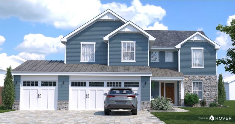
The best exterior house colors are the ones that fit your home’s architecture, roof and surroundings. Most homes look best with a simple three-color palette: a main body color, a trim color and one accent color for the front door or shutters. Start with the fixed elements you cannot change, test large samples in real daylight, and commit only when a color still looks right in morning, midday and evening light.
This guide explains how to choose exterior house colors step by step, from reading your roof and brick to using the 60-30-10 rule. If you are planning the whole project, not just paint, our complete guide to designing a house exterior puts color in context, and our step-by-step planning guide shows the order to make each decision.
Start With the Colors You Cannot Change
Every house already has colors that paint cannot change: the roof, brick or stone, window frames, driveway and any unpainted masonry. Those fixed colors are your starting point, not an afterthought. A warm brown roof, for example, clashes with a cool blue-gray body color, while a gray roof pairs naturally with cool whites and blue-grays. Hold paint chips against each fixed surface in daylight and discard any color that fights with it before you fall in love with it.
Pay the same attention to the undertone, the warm or cool cast hiding inside a neutral. White paint can look pink, yellow, green or blue on a sunny wall, and gray can turn lavender or green next to brick. Compare several near-identical samples side by side on the same wall, because the difference between two whites is often easier to see in a row than alone. When in doubt, choose the color whose undertone matches your roof and stone, not the one that looks best on a small chip indoors.

Credit: www.hgtvhomebysherwinwilliams.com
Choose a Palette by Architectural Style
Architecture narrows the choices in a useful way. A Colonial or Georgian home suits a classic combination such as a white or cream body, dark shutters and a black or deep red door. A Craftsman bungalow looks at home in earthy greens, warm browns and muted golds, with the trim a few shades lighter than the body. A modern home can carry a restrained palette of charcoal, white and natural wood, while a cottage or coastal home suits soft blues, sea greens and warm whites. You do not need a period-perfect match, but a palette that respects the style will always look more settled than a fashionable color applied to the wrong house.
Your roof color deserves its own decision, not a guess. A dark roof allows a lighter body color to stand out, while a light roof needs a body color with enough depth to avoid looking washed out. If you are also thinking about the roof itself, check its color against the body and trim samples together, in daylight, before you order paint. The three colors should read as one scheme from the street, not as three separate choices.
Browse more exterior design ideas for the style you are working with, and note how other homes in the same style use trim. Trim is where style shows most: narrow white trim sharpens a traditional house, while wider, tone-on-tone trim softens a modern one. Keep the number of colors low — three is enough for most homes — and let the architecture, not the paint chart, decide where each color goes.

Use the 60-30-10 Rule for Body, Trim and Accent
The 60-30-10 rule keeps a palette balanced: about 60 percent body color, 30 percent trim and secondary surfaces, and 10 percent accent. The body color covers the siding or stucco, the trim color covers window and door frames, fascia, porch posts and railings, and the accent is reserved for the front door, shutters and perhaps a small detail. One strong accent is enough; two compete with each other and make the house look busy.
- Body, 60 percent: the main siding or stucco color that sets the mood of the house.
- Trim, 30 percent: window and door frames, fascia, porch posts and railings.
- Accent, 10 percent: the front door, shutters and one small detail, used sparingly.
Apply the rule with contrast in mind. Light trim on a dark body makes windows and doors stand out, which suits a traditional home, while trim close to the body color gives a calm, modern look. For the accent, choose a color you would happily see every day: a deep navy, forest green, brick red or black front door rarely dates, while a bright or trendy accent is safer on a small, easily repainted surface. Painting the front door is also one of the cheapest high-impact changes you can make — our guide to designing a house exterior on a budget puts it first for a reason.
How Light and Surroundings Change Color
The same paint can look like two different colors at different times of day. Morning light is cool and blue, midday sun washes color out, and late afternoon light warms everything toward gold. A color that looks crisp on a shaded, north-facing wall can look glaring on a sunny, south-facing wall, and a soft sage can read as gray on a cloudy day. Never choose a color from a paint chip indoors, under artificial light, without seeing it on the house itself.
Look beyond your own walls, too. Trees, lawn and neighboring houses reflect color onto your home: green foliage casts a green tint, red brick next door warms a pale wall, and a dark fence can make a light body color look brighter by contrast. Light colors can also help a small house look larger and more open, as explained in our guide to small house exteriors. Walk the street, note which houses you keep looking at, and ask what their colors are doing — usually it is a restrained body color, clear trim and one confident accent.
Test Samples Properly — and Avoid Common Color Mistakes
Buy sample pots of your top two or three colors and paint large swatches — at least two feet across — on different sides of the house, on the actual siding material where possible. Look at them over several days, in sun and shade, and from the street rather than from a few feet away. A swatch that looks perfect close up can be too pale or too dark at curb distance. Paint the swatch next to the trim color as well, because body and trim are always judged together, never alone.
The most common mistakes are easy to avoid once you know them. Choosing a body color that is too light makes it disappear in bright sun, while a very dark body can show every scuff and fade unevenly. Painting every surface a different color, copying a color from a house with a different roof or light, and skipping the trim are all mistakes that cost far more to fix than to prevent. Test first, take your time, and remember that a timeless palette you like in all lights will outlast any trend. For the entry itself, our guide to the front of the house and curb appeal shows how the door color works with the porch and path.
Frequently Asked Questions
How many exterior colors should a house have?
Three is the right number for most homes: a body color, a trim color and one accent color. A fourth color can work on a large or complex house, but only if it is close in tone to one of the other three.
What is the 60-30-10 rule for house exteriors?
It means about 60 percent body color, 30 percent trim and secondary surfaces, and 10 percent accent on the front door, shutters or other details. The split keeps the palette balanced instead of letting two colors compete.
How do I test exterior paint colors before painting?
Paint large swatches on at least two sides of the house, next to the trim color, and check them in morning, midday and evening light over several days. Also view them from the street, where distance changes how strong a color looks.
Should exterior colors be warm or cool?
Match the undertone to your fixed surfaces: warm roofs and brick suit warm whites, creams and earthy colors, while gray roofs and stone suit cool whites and blue-grays. Mixing warm and cool undertones is the most common reason a palette looks off.
What exterior color makes a house look bigger?
Light colors make a house look larger because they reflect more light, especially pale whites, soft grays and warm off-whites. Keep the trim close to the body color for the same reason, and save dark colors for the front door or other small accents.
Conclusion
Good exterior color is not about finding one perfect shade. It is about a palette that fits the architecture, works with the roof and surroundings, and still looks right in changing light. Start with what you cannot change, use the 60-30-10 rule, test large samples, and choose the colors you will still like in five years — that is a palette worth painting.

My name is Mahi Uddin, and I’m a blog writer with over two years of experience specializing in creating engaging, informative content using AI tools. I contribute to InExDecor.com, where I share creative ideas and practical tips for transforming interior and exterior spaces into beautiful, functional environments. With a passion for storytelling and a knack for blending creativity with technology, I strive to craft blogs that not only inform but also inspire readers. When I’m not writing, you can find me exploring design trends or enjoying a good book with a cup of coffee.