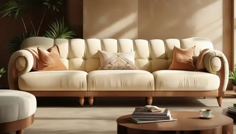
Picking the ideal paint color for your living room can be daunting. After all, this is the heart of your home, the place where family comes together, where friends and visitors are welcomed. Whether you’re after a calming haven or a lively, colorful environment, the right paint color can completely alter the feeling of your living room in no time.
Here, we’ll explore the factors, trends, and expert advice for choosing the right paint colors for living rooms.
Why Choosing the Right Paint Color Matters
Paint color is more than a design element; it serves as a defining factor that can set the tone of the entire room when it comes to decorating your living room. The right hue can set a mood, enhance your décor and even affect how small or large and bright a space feels. Whether you’re hosting a raucous soiree or enjoying a quiet evening at home, the paint color acts as a backdrop that creates an atmosphere for every activity.
Let’s delve into how paint colors impact our emotions and how they contribute to the room ambience to understand why paint colors are so important.
The Meaning of Colors and Its Psychological Associations
Did you know, colors have the ability to affect our emotions? This is why selecting the appropriate hue for your living room is that important. Each color has its own psychological effects: colors help shape what emotions everyone in that space feels.
- Warm Colors: Red, orange, and yellow colors are energetic and attention-grabbing. Red is passionate and exciting, and yellow brings a cheerful, sunny attitude that lightens the mood. These hues are ideal for creating a welcoming space brimming with life and warmth. But if they’re overused, they can feel overbearing, so they best suit as accents or with neutral tones.
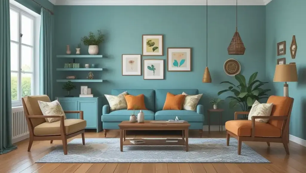
- Cool Colors: Alternatively, cooler hues like blue and green are well-known for their tranquil and calming effects. Blue — usually the hallmark of trust and calm — is a wonderful color to achieve a serene living room. Green, associated with nature, elicits relaxation and harmony, making it a great choice for spaces that aim to feel fresh and grounded.
- Neutral Colors: Colors like white, beige, and grey may not strike as emotionally charged colors, but they are essential to achieve balance and versatility. They provide a blank canvas for furniture, artwork, and decor to pop while still keeping a subtle elegance.
- Dark and Dramatic Shades: Deep navy, charcoal, or plum can also imbue rooms with feelings of luxury, sophistication or, even introspection.” These can work beautifully in formal or contemporary living rooms, but great lighting and considered contrast are needed to ensure that a dark color doesn’t drag a room down.
Knowing the feelings that colors contribute to allows you to design your living room with the right atmosphere in mind. Whether an energizing family space or a soothing retreat, the right palette is key to setting the emotional tone.
The Role of Paint in Setting the Room’s Tone
Paint colors not only influence mood, but also play a basic role in setting the personality and style of your living room. Because the walls are really the most prominent part of the space, they are like a canvas that grounds all other design decisions. Here’s where paint color plays a role in the tone overall:
- Creating Cohesion: The color you select connects all the spaces in the room, including furniture, rugs and décor. For instance, a soft neutral such as beige or grey can tie together disparate styles, making the space feel cohesive and intentional. On the flip side, bold accent walls can be a statement piece, drawing attention to an area of focus, such as a fireplace or gallery wall.
- Styling it Up: Paint colors can complement the style you’re after. A cosmopolitan living room might have smooth grey walls or crisply white ones, while a boho palette might have earthy hues with shades of terracotta or sage green decor. The paint plays the role of the background for the style of the room, whether that be a minimalist backdrop or a maximalist living space.
- Shifting the Perception of the Space: Paint can also alter how your living room is seen. Light colors create the impression that a small room is larger and more open, whereas darker tones create coziness and intimacy in larger spaces. Strategic use of color can also demarcate separate zones in an open-plan living space, such as a bold hue to separate a reading nook or seating area.
- Start with Mood and Ambiance: Picture a living room with brilliant white walls, natural wood furniture and gentle pastel accents—it feels calm, fresh and welcoming. Now imagine that same room painted a deep, rich navy and accented in gold—and it becomes dramatic, luxe and a little formal. The color you select can change the vibe immediately, from friendly and inviting to sleek and upscale.
In the end, your living room’s paint color is not merely aesthetic. It is creating an environment that matches your way of life and makes your daily experience better. By being aware of the psychological and stylistic effects of your choices, you can design a living room that has a real sense of home.
Recommended Factors to Consider in Choosing Paint Colors
Finding the perfect paint color for your living room is not just about selecting a shade you love; it’s all about taking several factors into account for the color to complement the room and your lifestyle. From your room’s scale and lighting to your current furnishings and aesthetic, these components can help you choose one that will elevate your living room design.
Room Size and Lighting
The size of your living room and how it works with light is one of the most crucial factors when selecting paint colors. Paint can have an enormous effect on how a space feels — cozy or expansive, bright or subdued — depending on these variables.
- For Smaller Living Rooms: Light shades — think soft whites, pastels or muted neutrals — tend to create the illusion of a larger, more open space. These colors will reflect light and create the illusion of more space. Pass on colors that are too dark or saturated, as those will close the room in.
- For Great Rooms: In larger spaces, you can go bolder in darker and richer tones. Rich blues, greys, or even jewel tones lend a feeling of intimacy and depth to expansive rooms. Additionally, you can use accent walls to add interest without cluttering it.
- The Influence of Light: The amount and direction of light that falls in your living room during the day is also a key factor that changes the appearance of paint colors.
- South-Facing Rooms: The good amount of natural sunlight that these rooms get can make warm tones such as beige, yellow, or terracotta glow beautifully.
- North-Facing Rooms: They can have cooler, dimmer light. To combat this, choose shades with warmer hues or yellow undertones.
- Artificial Lighting: The fixtures in your room — warm, cool or neutral light — affect how paint colors appear. Whatever you choose: always test your shade on the wall in your room under your specific lighting situations.”
Considering room size and lighting to choose a color that complements the room’s natural qualities and sets the desired mood.
Header Tag: Existing Furniture and Décor
The paint color in your living room should work with — not against — your furniture and décor. You want to design something that is harmonious and balanced where all elements flow into one another seamlessly.
- Neutral Colors for Flexibility: If your living room has bold or colorful furniture, a neutral wall color is a clean base on which to set your statement pieces.
- Complementary Brights: If you have understated furniture, you can treat your walls as a canvas and experiment with bold colors or patterns. A deep emerald green wall, for example, could make a simple beige sofa feel elevated, while giving an air of drama and personality to the space.
- Taking Décor Elements into Consideration: Don’t forget to consider items like rugs, artwork, curtains, and cushions. For example:
- If your rug has bold patterns, choose a wall color that draws from one of its more muted hues.
- If you have metallic or glass décor, colors like navy, charcoal or blush pink provide a chic, elegant backdrop.
- Neutral tones, such as taupe, sage or terracotta, work beautifully with wooden furniture, complementing its intrinsic warmth.
Taking into account your existing furniture and décor allows you to select a paint color that brings the whole room together, so it feels deliberate and well-designed.
Personal style and preference
After all, your living room is a private space that represents your personal style and character. Pick a color that speaks to you specifically and will turn the room into a place you genuinely like hanging out in.
- Timeless Sophistication: If you prefer traditional, timeless shapes, neutral tones like whites, beige or greys are a neutral safe and sophisticated option. These hues are constantly on-trend and act as a perfect neutral base for various design elements
- Modern Trends: For the trendsetters out there, maybe you’d prefer a bold color, or the popular sage green, navy blue, or soft blush tones. Suit less visible shades give your living room a contemporary, new experience.
- Daring Designs: If you’re quick to the colorful-daring wardrobe, don’t feel you have to avoid rich jewel tones, dark accent walls or even unexpected color combos. Deep teal, mustard yellow or even a moody black can make for bold, unforgettable living rooms.
- Understated Sophistication: If you lean toward a quieter, minimalist vibe, gentle pastels or earthy shades such as clay, taupe or olive green lend a serene, sophisticated air.
Best Paint Colors for Living Rooms to Refresh Your Space
Selecting paint colors based on your personal design style guarantees that your living room is not just stunning, but also feels truly “you.”
Finding the right color may take some time, but by incorporating practical elements such as the size of the room, the amount of sunlight it gets, and your likes and dislikes, as well as current décor pieces, you can feel comfortable selecting the best paint color for your living room. This careful consideration proves the space is as practical as it is beautiful.
Timeless Look with Neutral Colors

Neutral shades are an essential building block of interior design, and with good reason. Tones like this offer versatility, elegance, and flexibility for evolving fashions and home décor over the years. Neutral tones are a great fit for living room wall paints since they serve as a neutral baseplying around a host of furnishing types, ornamental features, and colors.
Here’s an in-depth look at some of the most popular neutral paint choices, and why they continue to be go-to shades for living rooms.
The World’s Leading Home Design Software of 2025
A Fresh Look with Bright White Tones
Chirisobs — yes white walls are also known as thuchisobs — are a timeless design choice. The Result: (1) Open and airy — they illuminate your living room, making it feel more spacious. Whether your design vision includes a classic, modern or minimalist aesthetic, shades of white provide an ideal backdrop.
- Cool Whites: These whites have a touch of blue or grey in them that gives them a fresh, modern look. They befit a contemporary-styled living room with uncluttered furniture and metallic or glass chakra. Cool whites are especially effective in spaces with lots of natural light, calling attention to the brightness without feeling harsh.
- Warm Whites: If you go more beige or yellow based warm whites, you will add some comfort and softness into your room. These colors are ideal in traditional or farmhouse-style living rooms, particularly alongside natural wood furniture or rustic accents.
- Off-whites and creams: These colors fall between cool and warm whites, making them end up being transitional style-friendly options. Creams convey a gentle warmth that’s welcoming yet retains all the clean sophistication of classic white walls.
White walls also give your furniture, artwork and textiles a spotlight. Whether you’re showing off a bold statement sofa or an intricate gallery wall, white ensures that all eyes on your decorative elements.
Beige and Taupe for a Cozy and Inviting Vibe
If you want some warmth in your living room but don’t want to go bold or bright, beige and taupe are good options. They have a comforting and homey vibe, which makes your living room your own little nest.
- Beige: A traditional neutral, beige is an understated soft tone great for a range of design styles. Try pairing this with wooden furniture and natural textures like jute rugs or linen curtains to derive a relaxed, organic aesthetic. Beige also looks great next to soft blues, greens, or blush tones for a more subdued touch of color.
- Taupe: A darker, richer neutral, taupe merges aspects of beige and grey for a chic and contemporary look. This high-impact color and versatile shade leans warm or cool depending on undertones, adapting easily to different lighting types and décor styles. Taupe is especially striking when combined with metallic accents such as gold or bronze, and with rich, jewel-toned accessories.
- Layered Tones: Beige and taupe can be layered over other neutrals for depth and dimension in your living space. For example, you can apply a lighter beige to the walls and use taupe furniture or accents for a continuous, harmonious effect.
Beige and taupe, for example, are particularly well-suited for family spaces: Their warm tones help create an inviting atmosphere for lounging or entertaining.
Graham & Brown: Greys: The Modern Neutral Palette
Gray has become one of the most popular neutral paint colors for living rooms in recent years—and there’s a reason for that. Grey also offers a hoard of tones that complement just about every aesthetic, be it clean modern or warm and traditional.
- Light Greys: Soft, pale greys are an excellent choice for establishing a calming, serene atmosphere. They also reflect light beautifully so these are excellent for smaller living rooms, or a space that doesn’t get much natural light. For a clean, polished look that never goes out of style, pair light grey walls with white trim.
- Mid-Tone Greys: These greys have a slightly warmer note still, lush and deep with transitional or contemporary living rooms in mind. Mid-tone greys work beautifully with bold items of furniture or colourful accessories and will let you introduce character and style without making the room feel cluttered.
- Dark Greys and Charcoal: (If you want to make a bold statement) Darker gray tones, like charcoal, can bring drama and elegance to your living room. These hues are right at home in larger areas with ample biophilic light as they can trap smaller spaces. You can pair dark greys with metallics, jewel tones, or bright artwork for an elegant contrast.
The versatility of grey also makes it an ideal option for open-concept living spaces, moving easily between environments and complementing other colors effortlessly. Whether you’re going for monochromatic or pairing it up with brighter colors, grey provides a chic and modern base for your design.
Neutral shades such as white, beige, taupe and grey bring timeless appeal to living rooms, so they are a safe yet stylish choice. Their versatility means you can play with different furniture, décor and accents over time, helping your space feel fresh and relevant for years to come. Knowing the individual qualities of each shade allows you to choose the perfect neutral tone in order to create a living room that is aesthetically pleasing while also pleasing to live and socialize in.
Abstract Painting: Bright Colors for a Splash of Personality
If you want to bring energy, personality and individuality into your living room, bright color is the way to go. Unlike neutrals, the vibrant hues infuse easily personality and boldness, making a statement in your space that reflects your taste and creativity. From cool blues to warm yellows and rich reds, these colors are able to turn your living room an energetic and motivating atmosphere. So let’s see how these bolder shades can liven up and personalize your space.
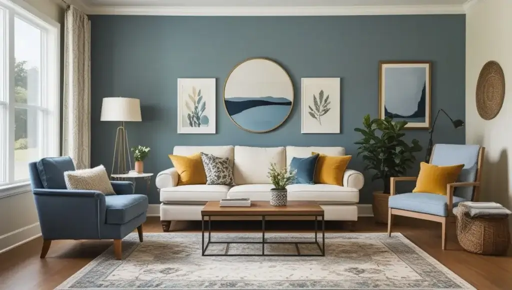
Beautiful Blues Make for a Tranquil But Dramatic Room
Blue is a highly versatile color and its stronger shades — navy, cobalt and royal blue — can lend drama and serenity to your living room. These colors are all well-suited for achieving a sophisticated, modern vibe that feels both chic and down-to-earth.
- Navy Blue: Navy seduces the eyes and pairs the elegance and depth. It works beautifully as an accent or even as the primary color in larger living rooms. Layer with metallic touches such as gold, brass or silver for glamor, or temper it with neutral furnishings and light-toned textiles for a more balanced design.
- Cobalt and Royal Blue: These saturated blues bring a jolt of energy without losing their calming, pacifying quality. These are perfect for modern living rooms with minimal or eclectic decor. Pair cobalt blue with touches of white or natural wood for a fresh, clean look.
- Use in Textures: Strong blues pair especially well with textured materials like velvet, linen and leather. A navy blue velvet sofa or cobalt throw pillows provide bold contrast to lighter walls or natural wood tones.
Deep blues are perfect for the moody but welcoming living room, offering a striking calmness in a way that still feels fresh and never dull.
Energizing Yellows for Bright, Happy Vibes
Yellow symbolizes sunshine, happiness, and warmth, making it a wonderful color option for living rooms in need of a cheerful boost. Soft pastels have their place, too, but whatever shade you choose, yellow is energizing and cheerful, and helps any space feel more active and welcoming.
- Mustard Yellow: Shades of mustard are ideal to creating an inviting space that won’t feel too overpowering. They come alive when paired with earthy neutrals like taupe, beige or olive green. A mustard yellow accent wall or statement armchair adds a color dynamic but keeps the overall tone classy.
- Warmed Yellows: A bright, playful aesthetic will appreciate the vibrancy of sunflower or lemon shades to help energize a room instantly. These shades also work well in bright rooms because they reflect the light, making the space feel brighter and even more sunny. Pair bright yellow walls with contrasting navy or grey furniture for a balanced, yet striking look.
- Golden Tones: For a more low-key approach, choose golden yellows that bring warmth without overtaking the space. These hues work especially well in traditional or vintage-inspired living rooms, particularly when combined with antique furniture or warm wood accents.
Yellow is an optimistic energizing color that is great for family and also inspiring rooms.
Sophisticated Reds for a Luxurious Touch
Opulent, dark reds are all about luxury and drama. Rich and deep tones of red like burgundy, crimson, and ruby can make a powerful statement in your living room, inspiring passion, confidence, and elegance.
- Burgundy: This deep, rich red has a royal, timeless quality, making it perfect for more formal living rooms, or those with retro-style furniture. Burgundy walls and dark wood furniture with gold accents are drenched in opulence and old-world charm.
- Crimson: If you prefer a touch more brightness but still want drama, crimson is a perfect option. This red releases energy, warmth, and a sense of sophistication into a room. You can use it as a statement wall or add it through decorative items like curtains, cushions or a statement rug.
- Balanced Neutrals with Reds: A good way to use a red shades in the home and not have it overpowering is to balance it with neutral shades (white, beige, grey) For instance, over a burgundy wall it is advisable to place a couch that shall be in a brighter color like white or beige, to make the space seem larger and airy.
- Accents and Finishes: Reds are stunning with metallic finishes, particularly in golds and bronzes. Use these tones in light fixtures, mirrors, or picture frames to heighten the luxurious atmosphere.
Upmarket reds are perfect for producing a warm, intimate vibe, keeping them ideal for formal living rooms, reading nooks or areas set up for evening entertaining.
Cozy Nature With Earthy Shades
Get Nature to Get You Calm with Olive Greens
Green is a flexible color that links your inside space to the outdoors. Rich olive and sage greens bring a soothing, grounded feel, ideal for relaxed living rooms.
Earthy Terracotta and Clay tones for Rustic Appeal
Rich terracotta colors add warmth and texture to those walls. They look great with bohemian or Mediterranean-inspired interiors.
Browns and Wood Inspired Tones for Warmth
Rich textural tones range from chocolate brown to caramel hues and make for an earthy warm ambience. They also improve spaces with wooden flooring or furniture.
Trending Living Room Paint Colors

Contemporary living rooms are all about mixing style and comfort, and trending paint colors reflect that emphasis. Today’s color trends are daring and inventive and flexible with many methods. Whether you love soft and soothing tones or bold and dramatic shades, these trending paint colors can take your living room’s aesthetic to the next level.
So let’s take a look at some of the most trending paint colors for modern living rooms and how can they can elevate your space.
Light and Fresh: Soft Pastels
Soft pastel shades return to the fore in modern living room interiors for their ability to impart light and airy ambience. Blush pink, lavender, and mint green add an aura of modernism to your space, along with bringing in a tranquility to the room.
- Blush Pink: This soft but warm hue provides an understated elegance to your living room without seeming too feminine. Neutral furniture in beige or cream tones teams beautifully with blush pink, as do metallic accents such as gold or rose gold.
- Lavender: Lavender is great for a dreamy, tranquil vibe. Because of its cool undertones, it works nicely in rooms with ample natural light, and it pairs well with gray, white or silver accents for a seamless look.
- Mint Green: This fresh, nature-inspired hue is an excellent match for modern living rooms that strive for a soft and airy aesthetic. Mint green goes well with white furniture and natural wood, making it a good pick for Scandinavian or minimalist designs.
Soft pastels really work well in smaller living rooms because they reflect light and help to make the room feel open and inviting. They are also the perfect backdrop for statement furniture or bold decorative pieces.
Eye-Catching Matching Outfits in Deep Jewel Tones
Jewel tones are the way to go if you want to make a striking impression. Rich, luxurious colors like emerald green, sapphire blue and amethyst purple are trending in modern living rooms. These tones lend depth and drama to a space, making them ideal for anyone who likes a bold and sumptuous design.
- Emerald Green: Emerald green is a vivid color that brings sophistication and is a reminder of nature. It pairs perfectly with gold or brass accents, as well as with dark wood furniture or black-and-white décor for a chic, contemporary vibe.
- Sapphire Blue: Sapphire blue gives a royal and sophisticated look. This darker hue suits an accent colour best, perhaps on a feature wall, or paired with lighter hues of grey, beige or white. Incorporate velvet textures and a metallic finish for a luxe feel.
- Amethyst Purple: Combination of bold and moody these are the color tones to set a dramatic and artistic space. Because the deep, rich tone of Amethyst purple can give a room an upscale feel, it’s best paired with soft pastels or neutrals to help balance out the color and prevent from overwhelming it.-
Chuchvara Jewel tones work well in larger living room or spaces with lots of light, as they can if too dark make a room look enclosed. Combined with soft fabrics such as velvet, layered rugs and statement lighting fixtures, jewel tones can create a living room that is both dramatic and snug.
Unique Design Approach Using Dual-Tone Walls
Dual-tone walls are one such innovative trend that adds depth and intrigue to the modern living room. This design trick has been around for quite some time and involves painting two coordinate colors on your walls usually separated by a chair rail or molding for maximum visual impact.
- Traditional Dual-Tones: A common mix is to shoot a darker color on the lower part of the wall and a pale pastel on the clear a part of the wall. Complementing upper and lower halves with personality: a soft grey or white on the upper half, navy blue on the lower half, for instance, makes for a balanced, sophisticated image.
- Bold Statement: If you want to get noticed, wear contrasting colors such as olive green to mustard yellow and blush pink to charcoal grey. These combos add character and turn your walls into a feature in the room.
- Textured Separators: To take the dual-tone effect to the next level, try adding a textured or patterned separator where the two colors meet. A piece such as wood molding, metallic trim, or even a painted geometric design makes the transition between colors more interesting.
Without going overboard with décor, you can build depth and dimension in your living room with dual-tone walls. An especially potent technique in contemporary or eclectic interiors, where whimsy and originality are everything.
How to Select the Best Paint Finish
So while picking the perfect color is essential, the finish of your paint is equally so. The paint finish affects how light plays with the walls, how easily the surface wipes down, and how much it conceals flaws. Finishes come in all forms, meaning different finishes serve different purposes, so it’s important to pick one that goes with the style and function of your living room.
Here’s a closer look at two primary things to think about when selecting the finish for your paint:
Matte or Glossy Finishes: The Need to Be Knew
Your choice of finish can have a significant impact on the appearance and mood of your living room. Matte and shiny finishes have different characteristic properties of each kind of style and usage.
Matte Finish:
While satin paint has a sheen, matte paint (or flat paint) has none to speak of, leaving behind a smooth, velvety finish.
Pros:
- Covers up the flaws in the wall like dents or uneven textures.
- Provides a modern, understated look that can complement minimalist or contemporary settings.
- Adds softness and warmth to a space, especially when you pair it with warm or neutral colors.
Cons:
- Matte finishes are less durable, more susceptible to staining and harder to clean.
- They work best in low-traffic areas or on walls that aren’t getting wiped down on a regular basis.
Glossy Finish:
Depending on the sheen, glossy paint reflects light, resulting in a shiny, smooth surface.
Pros:
- Infuses your living room with a touch of glamour.
- Great for accent walls, trim, and architectural elements, since the shine calls attention to areas.
- Durable and wipeable, it’s perfect for areas that may be prone to smudges and fingerprints.
Cons:
- Glossy finishes bring imperfections to the forefront, so the wall surface should be smooth and well-prepared.
- In a large space all walls may be too reflective.
When to Use Them:
- Go for a matte finish if you want to achieve a calm, understated look, or if your walls have blemishes you want to disguise.
- Reserve glossy finishes for accent walls, doors, or trims that you want people to touch and contrast with the surrounding child.
Durable Finishes for High-Traffic Areas
If your living room is a high-traffic zone, durability should be among your top considerations when choosing a paint finish. Others are a balance between practical and aesthetic use, making them great for permanent areas where style and use are equally important.
Satin Finish:
Satin finishes have a hint of sheen, providing a soft sheen that catches the light but isn’t too glossy.
Pros:
- It is effortless to clean and maintain, making it a suitable alternative for houses with children or pets.
- Easier to resist scuffs or stains than matte finishes.
- Delivers a soft, delicate appearance that suits both traditional and modern lounge areas.
Best For:
- High-traffic walls.
- Living-room areas with high touch points, such as near light switches or doorways.
Eggshell Finish:
Eggshell falls between matte and satin, with a low sheen that gives a little shine without the reflective surfaces of satin.
Pros:
- More durable and easier to clean than flat or matte paint.
- Delivers a sophisticated, old-fashioned look while suiting multiple styles.
- Better than glossier finishes at minimizing the look of fine imperfections.
Best For:
- Glam areas that still need durability—but we have to have both!
- Walls that would be of polished but yet understated finish.
Why Durability Matters:
In family rooms where people congregate often, walls take a beating, from fingerprints and scuffs from furniture. Opting for a durable finish, like satin or eggshell, means that your living room walls will look great for years to come, and will be easy to care for when needed.
Key Takeaways:
- Opt for matte finishes for a modern, understated look or when you’d like to disguise any imperfections.
- Use glossy finishes to accentuate architectural elements or for a touch of glamour.
- Satin or eggshell finishes strike the right balance of durable and fancy for high-traffic areas.
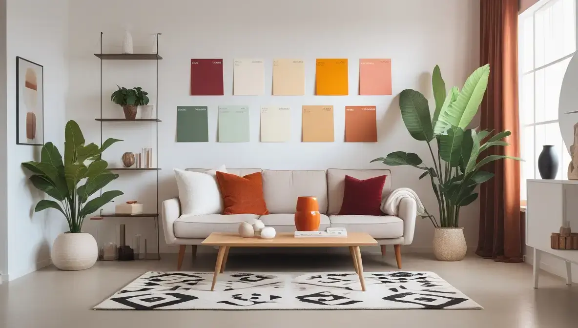
How to Sample Paint Colors Before Making a Commitment
Sizing of Paint Samples and Swatches
Never make a final decision based only on a paint chip. Paint sections of your wall, or, if you have the space, create large swatches to see what the color looks like in your living room. The sample size helps you envision the final product.
Experiencing the Color at Various Points in Time
The look of colors will be dramatically different, depending on the time of day and lighting conditions. Check the chosen paint out in daylight, artificial light, and in the evening, to confirm that it holds up to expectations in all scenarios.
Make sure to avoid these common mistakes on your living room paint
Undertones in Paint You Are Ignoring
Undertones are the underlying shades that exist subtly below the dominant color. A grey paint, for instance, may have blue undertones that can conflict with warmer hues for furniture. Always test the color, and think about how its undertones work with the rest of your design.
Ignoring Lighting Effects
They say lighting can make or break your paint color choice. Overhead lighting, table lamps and the direction your windows face all affect how the color looks. Evaluate your paint choices under different types of light.
Not Matching with Furnishings and Décor
The color of your wall should enhance your furniture and décor, not clash with it. Contrasting colors or too-daring options can render your sitting area more chaos than cohesion. Make sure to think holistically about your design.
Conclusion
Selecting your living room paint color sets an exciting adventure in motion, including dreams for a welcoming and stylish space. And by examining room size, lighting, and personal preferences, you can derive the perfect shade to support your vision. From classic neutrals to vivid colors to captivating hues, just make sure to sample your colors and finishes for a perfect finish.
Your living room is more than just a mere room — it’s a manifestation of your character and taste. Be creative and make it into a space you love to relax in.
FAQs
What color paint makes a room feel larger?
Using light colors like white, beige, or pale shades can help a small living room feel larger. Avoid dark, heavy colors that will make the space feel closed in.
What paint color goes with my furniture?
Think about the dominant colors in your furniture and décor. Neutral coloring greys, whites, or beiges usually serves most styles well. For a bold piece of furniture, choose a complementary wall color to help balance the look.
Do dark colors work for small living rooms?
Dark colors can definitely work in small living rooms if you follow it with good lighting and lighter accents. An accent wall, for example, navy blue, adds depth without being overpowering if the remaining walls are lighter.
Is it okay to have more than one color in your living room?
Absolutely! Use of multiple colors can be done with the help of accent walls, dual-tone designs or colors that complement each other in your décor. Just make sure the colors work together for a polished (but fun) effect.
How often should I paint my living room?
On average, you should repaint your living room every 5–7 years, depending on how much wear and tear you put on your walls. Areas with high traffic or homes with children and pets might need touch-ups or repainting more often.

My name is Mahi Uddin, and I’m a blog writer with over two years of experience specializing in creating engaging, informative content using AI tools. I contribute to InExDecor.com, where I share creative ideas and practical tips for transforming interior and exterior spaces into beautiful, functional environments. With a passion for storytelling and a knack for blending creativity with technology, I strive to craft blogs that not only inform but also inspire readers. When I’m not writing, you can find me exploring design trends or enjoying a good book with a cup of coffee.